A whiter shade of pale – August Director’s picks
Pared down. Stripped back. In interior design, a neutral canvas has endless possibilities, enabling a thoughtfully placed artwork to step to the forefront and tell the story of the room. Whether chosen in the planning stages as the foundation of a colour-free palette or placed as a finishing touch, a carefully curated piece of neutral art can add calm and cohesion to a beautifully designed room.
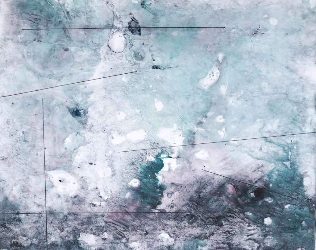
This month’s Director’s picks focuses on neutrality and achromatic colour schemes. In the absence of bright colour, texture, shape and form become the focal point, helping to create a sense of movement, warmth and fluidity.
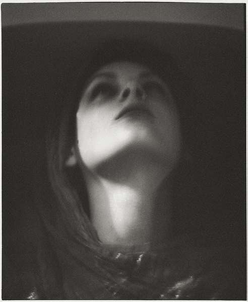
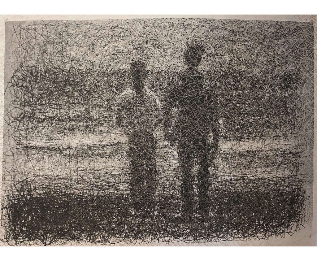
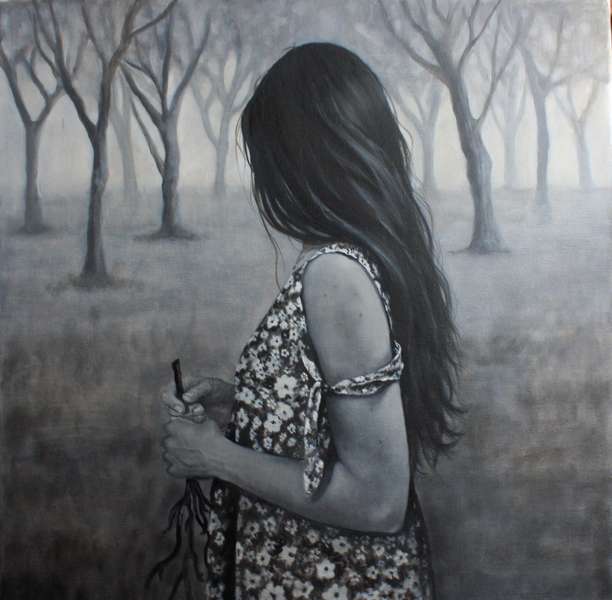
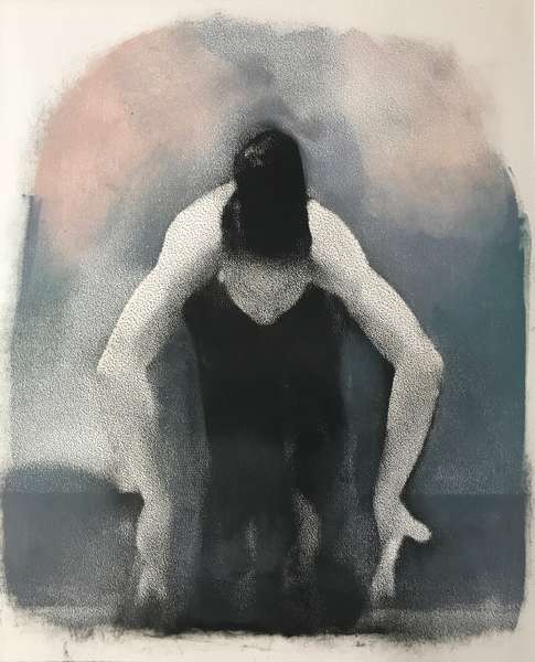
Many of the pieces in this collection capture intimate dream-like images with monochromatic figures evading our gaze. Vikram Kushwah’s A different kind of consciousness takes this to an almost spiritual level. We are compelled to interpret the evocative shadows in Barren Illusion by Danbin Cao as two figures blur the lines between illusion and reality. Hazy boundaries of movement and the human form are tested further in Margaret Ashman’s Nayami and in Judy Pilarczyk’s intimate Walking Away, as the viewer is left to interpret the harmonious interplay between human physique and psyche.
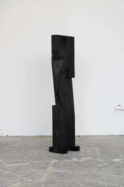
Sculpture can also make a bold statement in a neutral room. The striking wooden form of Nathan Henton’s monolithic Untitled (The Black Water) alludes to the void within the architectural landscape. Figurative and geometric shapes combine to create a tender depiction of humanity in John Clark’s The helping Hand.
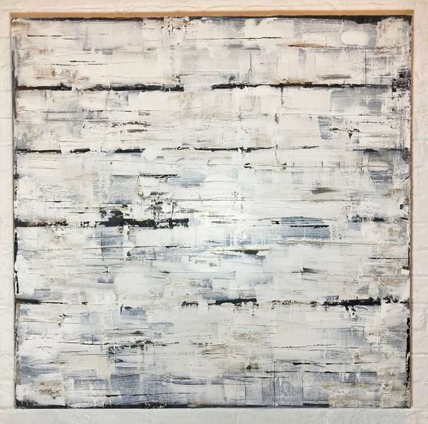
Multi-textured works form a large number of the collection this month. We are encouraged to delve beneath the layers of Ruth Richmond’s silkscreen print All in Order. Irregular angles and curves provide a stunning exploration of geometry and light formation in 17.39 by Andreas Soldini. Peter Evans abstract Two Hundred and Fifty Grand (Scratchcard Painting #18) also offers a refreshing celebration of an everyday object.
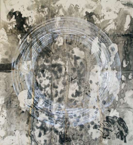
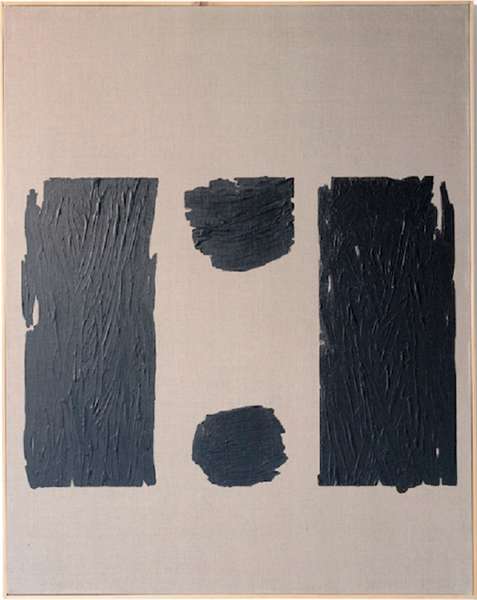
Finally, the elusive and transient nature of light is explored in a number of abstract works. Bold circles form an escapist vision in Glib Franko’s 48°23’11.8″N 24°27’34.9″E. Boogie Woogie by Janine Hall houses an expressive meeting point for light and shadow to dance across the canvas. Malgorzata Lapsa-Malawska achieves a sense of clarity and transient space within her Lifeline Reading Guide, while Configure III by Timothy Betton combines linear repetitions with multiple facades of paint to distort the space and play with boundaries.
In a void of colour, we are pushed to delve deeper and discover the spirit and essence of the pieces for ourselves. The strength of these artworks is in their subtlety and by building a room around them we create a much-needed space for contemplation and imagination.