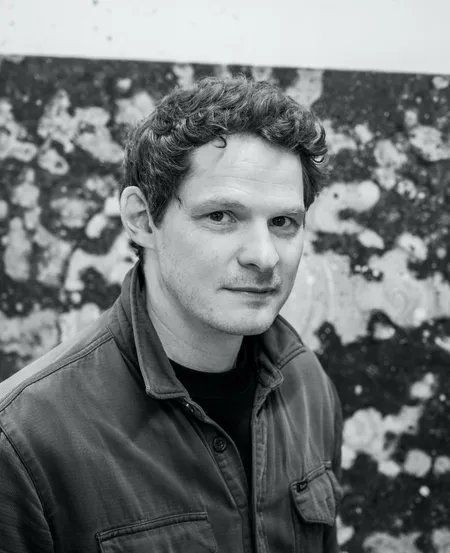
Ed Saye

Ed Saye

Follow me

Degree: MFA
University: Slade
Graduation Year: 2009

New Blood Art Commentary

See inside the studio of Ed Saye
See investable artists
See Investment tip II
See investment tip I 


Ed Saye’s searching images offer a contemplative reflection of atmospheric locations. Saye makes use of found photographs and intuitive editing techniques to lend his painting a familiar yet slightly anomalous feel. The use of warm hues and fragmented detailing softens the narrative of each piece and leaves an air of enigma.

The ambiguous choice of image, leaves an unsettling doubt about the tone of the scene; it may be an image reminiscent of family vacations besides an intentional absence which seemingly haunts the scene. This balance creates a strong sense of uncertainty and recreates the same specious quality as memory.  In turn, the viewer is left to interpret a space made equivocal through compositional tensions and pleasing handlings of light and tone.

Artist Statement

Realitopia. These are contemporary visions of paradise lost. Yesterday’s utopias viewed through the prism of the twentieth century’s alternative cultures. It’s what became of the great modernist project or a big hippie trip gone wierd.

These otherworldly landscapes and settings have a magical atmosphere and are populated by characters that lounge, flop, idle, dance and bathe against a psychedelic backdrop. Spectral hues infuse the paintings and the balance between light and dark is carefully poised. There is both a sense of hope and of melancholy – all is not lost but things didn’t quite work out as they were meant to.


Exhibition Review: No Promised Land by Paul Carey-Kent, February 2017:

The distinctive feature of Ed Saye’s paintings lies in what he does and doesn’t contrast. On the one hand, human constructions are set against nature, modernity against decay, and mainstream culture against alternative society. On the other hand, Saye eschews the effects of sharp tonal contrast, compositional focus around a primary point, dramatic textural variation, or bright colours. So the underlying contrast, the meta-contrast if you like, is: high contrast content versus low contrast means.

Take Modern House (all works discussed 2016): a melange of restrained, similarly-toned browns and greys sees a decrepit house – hardly meeting our expectations of ‘modern’ – blending back into the woods in an intricate mottling of overall pattern. The slight misalignments indicate that Saye’s source was several photographs from marginally differing angles. The border of one of those photographs cuts through the sky, and an earlier, sanded back version of the painting is visible through the layers. As in all Saye’s works there is a glow of warm, though mutedly mysterious, light coming from somewhere within the painting, attributable to an earlier layer.

Such decay has an air of poignancy, the more so when we know that we’re looking at Louis Kahn’s iconic Clever House in Philadelphia. The trope Saye employs has a healthy artistic tradition, of course: from the 19th century appreciation of the ‘romantic ruin’, to Paul Nash and John Piper’s aestheticisation of bomb damage, to Alex Hartley’s brand new reconstruction of a ruin currently viewable behind Victoria Miro’s gallery. It’s also present in the work of several contemporary painters whom Saye himself admires, such as Peter Doig, Stefan Kürten, Matthias Weischer and, in particular, New York based Puerto Rican Enoc Perez, who for two decades has been painting modernist buildings as relics devoid of the optimism they once exuded, and who – like Saye – uses elaborately indirect techniques to make his post-idealist images. The effects of time are emphasised: today’s promising future is tomorrow’s disappointing history.

Saye achieved Modern House’s layered fragmentation by direct patterning, tracing around complex areas like trees and breaking up large areas with intense mark-making. Cool Memories makes the fullest use of a different way to get to a similar end: Saye transferred paint from offcuts of loose canvas onto the painting, building up the layers and the image in this print-related way, employing stencils to mask off the bamboo pattern while the yellow background was built up, and vice versa. He was able to cover large areas without needing small brush patterns, and has the satisfaction of the process enacting the depicted deconstruction rather than imitating it by other means. The image is based on a wallpaper sample from the 1970s, albeit with the colours altered enough to put me in mind of the famous characterisation of the 1960’s: if you can remember them, you weren’t there.

Other paintings cluster around the same concerns. Good Intentions gives us a tepee made of brushwood. Is this a traditional dwelling, a self-build hippy interpretation thereof, or just a stack ready for the fire? Its habitability isn’t obvious. Again the colours are those of earth, wood and straw, and the dwelling seems likely to merge back into the woodland scene from which it has emerged. It’s plausible to read its shape as a modernist triangle, its hard edges softened by the more organic counterculture. Note the tie-dye aura hovering in the trees: perhaps the ideal will only be realised in the afterlife. ‘I aim to use colour and tone’, says Saye, ‘to create a sense of simultaneous hope and anxiety’.

If those paintings achieve an all-over flatness by consistency of patterning and tone in presenting what is actually a rather busy combination of different elements within each picture, Absence goes about it the other way. It’s based on a postcard of a motel swimming pool. Saye painted out the figures and the pool, so giving most of its area over to what now reads as blank space. That supplies the first kind of absence, contrasted with the second, ie that a chair – which is itself the most prominent remaining presence in the picture – has no occupant. But the suggestion is there…

How does the introduction of actual figures fit in? Quietly, of course. In Children of the Century, inspired by a found photograph of a group of hippies standing in front of a log cabin, their individuality is lost in a pool of near-grisaille pattern which threatens, appropriately enough, to integrate them with nature. The result feels timeless: of which century are they children? Does every century have its equivalents of the hippy impulse?

Given the context set by what Saye describes as ‘the compromised legacy of the idealism of yesteryear’, I took Mellow Yellow Pile to riff on Donovan’s height of flower power hit single ‘Mellow Yellow’ (1966), said to refer to the belief that smoking dried banana skins could make you high. That notion is now discredited, so Saye might be expanding his sense of disillusion to cover the escapist zone of drugs, and again reducing the contrast between conventional and unconventional ways of living – that mellow yellow pile was just a mainstream load of compost after all… But how banana-like is the pile? It turns out that it’s a coal heap, made in response to a short story called ‘Yellow Coal’ by the Russian writer Sigizmund Krzizhanovsky. Which just goes to show how an interestingly ambiguous painting can trigger directions of thought unintended by the artist and yet, arguably, none the worse for that.

So why the contrast in contrasts? The effect is to collapse and deaden the oppositions of content, to suggest that, when it comes down to it, man and nature, culture and counter-culture all come from the same place and will arrive, like Saye’s various painting techniques, at similar ends. Saye himself sees modernism and hippiedom as ‘two seemingly opposed cultural movements struggling in very different ways to achieve a similar objective’. There’s a good slug of truth in that, and yet we might wonder if things can be quite so simple. Yes, the paintings play down and disguise the differences, but maybe you only need to do that if the differences are real. Yet that shouldn’t worry us: the job of the artist is to raise questions, not to answer them. Saye has found an effective and distinctive way to make us wonder whether the difference between the modernist and the hippie is quite what we might assume it to be – and, who knows, to challenge binary assumptions tout court.

Solo Exhibitions

(2016) No Promised Land, The Foundry Gallery, London

(2013) Isolation Room, Isolation Room, Copenhagen

Group Exhibitions

(2023) Open Open, Chapel Arts Studios, Andover, Hampshire

(2023) Works on Paper 5, Blue Shop Gallery, London

(2023) A Generous Space 3, Huddersfield Art Gallery, Huddersfield, UK

(2023) to the birds, curated by Dan Howard-Birt, Exeter Phoenix, Exeter, UK

(2021) your FOOT in my FACE, Kingsgate Project Space, London

(2019) Reconstructing the Reality, Peyer Fine Art, Zurich

(2018) The SOLO Award 2018, Chiara Williams Contemporary Art, The Cello Factory, London

(2018) Beautiful Monsters, The Portico Library, Manchester

(2018) Beep Painting Prize 2018, Elysium Gallery, Swansea

(2018) Reconstructing Reality, 20:20 Iconic Art Vision at D10 Art Space, Geneva

(2018) The Landscape of Time, Contemporary British Painting, St Marylebone Crypt, London

(2017) Virtuality Mortality, Ugly Duck, London

(2017) Ruth Borchard Portrait Prize, Piano Nobile, London

(2016) Runaway Fingers, Pushkin House, London

(2016) Daylight Saving, Geddes Gallery, London

(2013) This Glitch, curated by Lee marshall, Blythe Gallery, London

(2013) Creekside Open selected by Paul Noble, A.P.T. Gallery, London

(2012) The Other Art Fair, Ambika P3, London

(2010) Grammar See, Rod Barton Gallery, London

(2010) Lead Slugs and Blank Spaces, Museum 52, London

Competitions, Prizes & Awards

(2013) Creekside Open - Finalist

(2017) Ruth Borchard Portrait Prize - Finalist

(2018) The SOLO Award - Finalist

(2022) Contemporary British Painting Prize - Longlisted

(2022) Studio In View Award - Artist Support Pledge - Prizewinner

Original works:

Sold Artworks: