Catherine Morgan
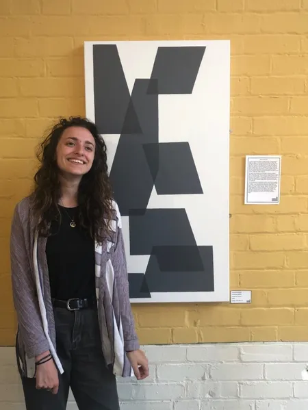
Degree: BA Fine Art
University: University of Leeds
Graduation Year: 2020
New Blood Art Commentary
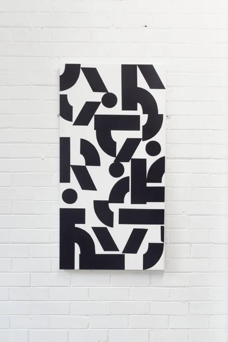
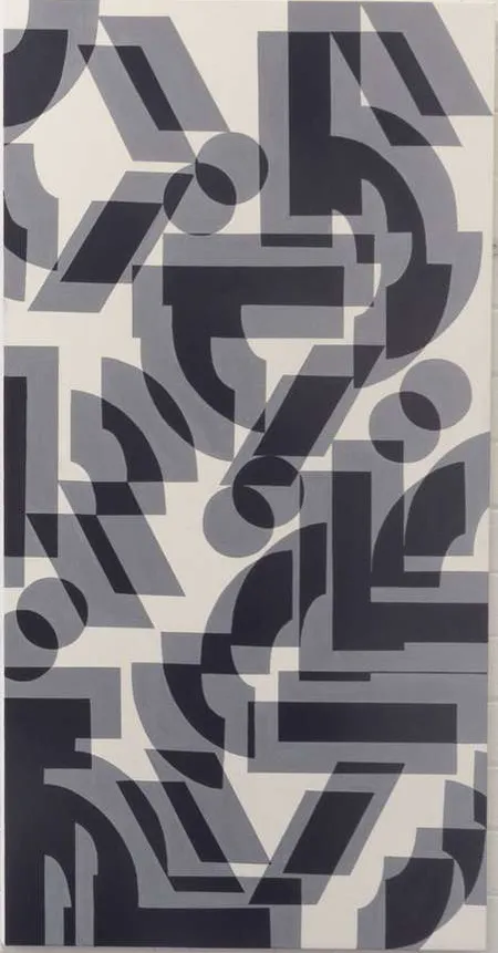
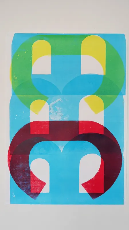
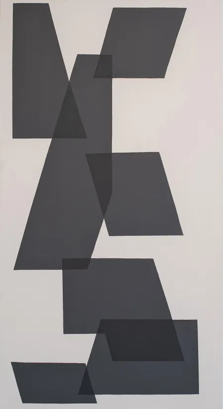
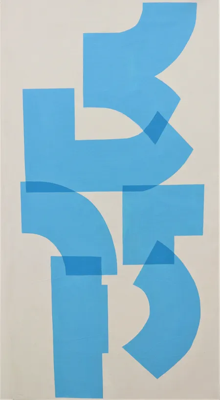
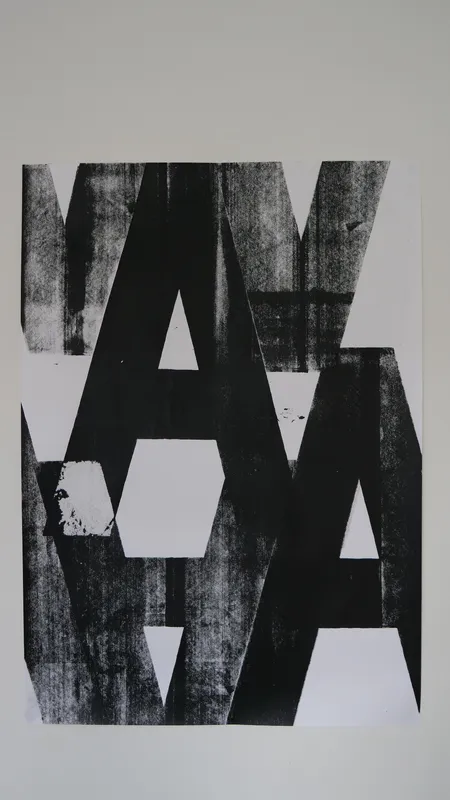
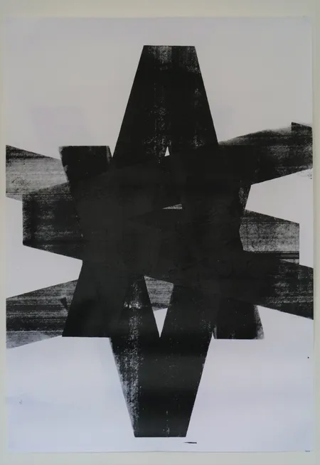
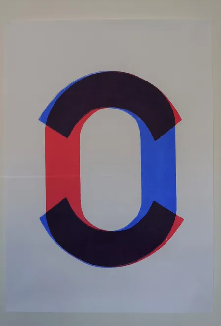
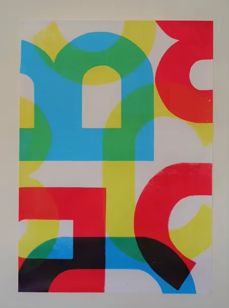
Catherine Morgan’s work exacerbates the boundaries of language. With the bold typography of each piece, viewers are pushed to mentally disrupt their habitual processes of interpreting textual matter. Not so much a breakdown as a breakthrough, letters are cleanly reduced to newly formed optical tools in which to reflect on the nature of communication itself. Morgan’s work particularly draws influence from the renowned practice of concrete poetry, where the visual arrangement of text supersedes the verbal. Within this mode of working, Morgan experiments with printing techniques and carefully chosen colour, in order to develop compellingly layered abstract pieces.
Artist Statement
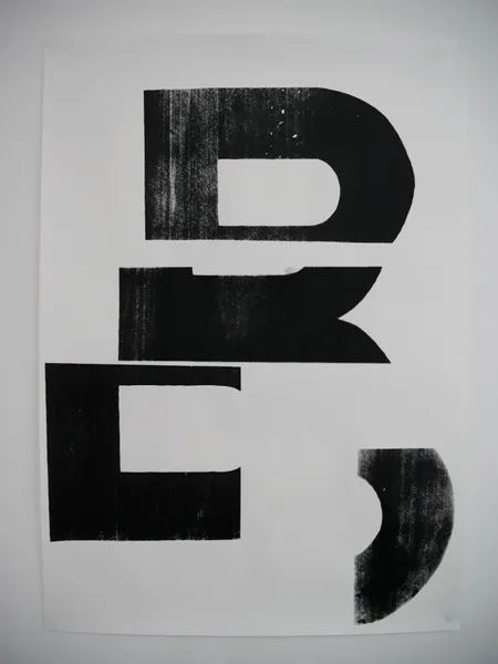
My work points to the inherent power of written language and how letters act as vessels of communication which have meaning bound to them. I aim to subvert this power by using the letter forms as visual tools to create an image that exclusively looks to form and shape, predominately using screen printing to do this. I play with whether the viewer reads my work or sees it as a visual image by layering letters, repeating them, twisting or breaking them apart. An essence of language remains but the letters are no longer bound to their understood meaning, pushing the boundaries of how long a letter’s function remains to the viewer.
By using the material of language as a visual tool, I align my work with concrete poetry practices, a key principle of this being letters as a visual image. Hansjorg Mayer’s type poems and prints and Derek Beaulieu’s books such as ‘Aperture’ (2019) both deconstruct or manipulate the recognisable images of letters and have been of key interest to me. The emphasis on clean lines, geometricized forms and reduction are all focuses of my practice, driven forward by looking at Tauba Auerbach’s Components drawings.
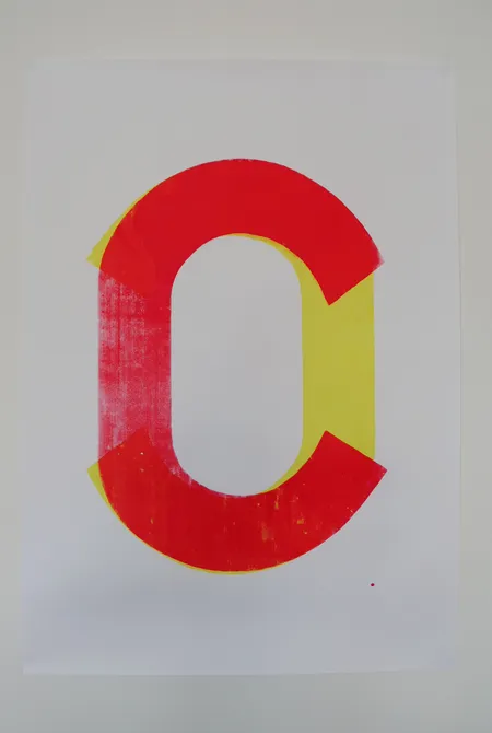
Printing as a medium is important to my practice as it allows me to reference the wider dissemination of written communication. New forms can be created through layering, and I see each piece as a new shape created from the rigid, recognisable structures of the letters. The balance between recognisable language and purely abstract shape is a line I balance so that an essence of language remains accessible to the viewer. There feels as if a message is just out of reach, something for the viewer to decode, whilst also being a study in shape and the strength of impression. Colour is also something I consider, looking to how this may heighten or change the overall impression of my prints, and how the colour may relate or juxtapose the mood of the form. I feel that black text on a white background was something that inherently referenced the printed word, with this being an instantly recognisable form for written language to take.
I try to disrupt the process of reading but not leave it behind completely. Through reading phycological studies on how we read and process language, I have discovered that by decontextualizing and abstracting singular letters, the brain’s routes of understanding both the semantic and the phonological aspects of the letter is likely disrupted. Therefore, the viewer is forced to acknowledge the processes of recognition and understanding that usually come as second nature whilst reading. They are drawn into spending an unnatural length of time deciphering the meaning of the parts they recognise but can’t access, emphasising the distinct geometric visual strength of the forms and subverting their literary power.
Group Exhibitions
(2022) Bring It!, Aire Place Studios, Leeds
(2021) Extract, Assembly House, Leeds
(2020) Ones To Watch 2020, Sunny Bank Mills Gallery, Farsley
(2020) Simmer, www.simmerleeds.com, Online
Original works:
Currently there are no works available for sale by this artist, check back again soon or contact us to be notified when new works become available.